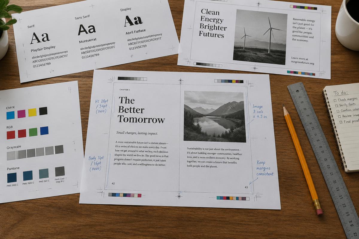
The overall design of the page
You can have intriguing information to convey, but if your design is faulty or just plain boring, your project will not receive appropriate attention. Good design can transform an otherwise mundane project into an effective, aesthetically pleasing tool of communication.
- Choose standard 8 x 11-inch white paper with a matte finish and a rag content of at least 25% for most projects.
- Use black ink for text. If you have a color printer, use it to highlight titles and graphics.
- A well-designed page has approximately 50% white space — space not filled with text or graphics — which emphasizes important sections and leads readers from one to the next.
- Create adequate margins: roughly 1½ inches on all four sides of a standard sheet. Bound documents should have a left margin of at least 2 inches.
Text and graphics placement
- Number graphics consecutively and place them as close as possible to the referent text.
- Balance text blocks and graphics on the page. Try not to have an entire page of text or of graphics.
- Lines within a paragraph are single-spaced, with a double space between paragraphs. Longer paragraphs may be double-spaced and/or indented.
- Construct paragraphs according to the material. Long paragraphs (about fifteen lines) carry large amounts of related material; short paragraphs break up monotony, organize instructions, and emphasize important information.
- Avoid "orphan lines" — a paragraph's opening line at the bottom of a page or column, or its last line at the top of one. Adjust leading or edit out superfluous material.
- Use numbered or bulleted lists for a series of distinct but closely related pieces of information.
Details of the document
- Type size is measured in points. The standard size for written material is 10–12 points; published materials may use smaller sizes to fit more into a standard format.
- A typeface is known as a font. Times New Roman is the standard for most documents; Times New Roman, Arial, and Garamond are industry standards.
- Fonts divide into two broad categories, serif and sans serif, referring to the fine strokes that appear on the main strokes of a letter.
- Alter the basic font to highlight specific pieces of information with bold, italics, or underline. Do not overuse highlights, and be consistent with the ones you use.
Headings
Use headings to indicate section shifts and give your audience a "road map" to the text. They break up lengthy sections that would otherwise be difficult to read, and should be informative yet concise.
Example
Parallel grammatical structure in headings
Incorrect headings — non-parallel structure: 1. Adding Plants and Decorations to a New Aquarium; 2. Condition the Water Before Adding Fish; 3. Fish Should be Floated for 15 Minutes; 4. Be Sure to Check the Filtration System Regularly.
Corrected headings — parallel structure: 1. Adding Plants and Decorations; 2. Conditioning the Water; 3. Floating the Fish; 4. Checking the Filtration System. By repeating grammatical patterns and shortening the headings, the writer ties the topic into a cohesive unit.
- Design a ranking system for headings in longer documents, with a main heading followed by at least two subheadings.
- Use different type sizes and fonts to distinguish levels of importance.
- Experiment with boldface and italics to indicate varying importance.
- Use no more than four levels of headings. More will confuse your audience and make the document look muddled.
- Do not "orphan" a headline at the bottom of a page or column — move it to the next one.
- The first sentence of a text block should refer back to the heading.
Adding color
One of the easiest and most effective ways to sharpen a document is to add color, especially when highlighting specific points.
- The least-expensive way to add color is colored paper, which gives the impression of color without the expense of color printing.
- On white paper, and on a limited budget, add one or two spot colors that do not overlap.
- Spot colors also work on overhead transparencies and other presentation documents. Remember that the primary colors — red, blue, and yellow — have a strong impact.
- Inkjet printers give great flexibility with color. Commercial printing uses either spot color, which is inexpensive, or the more expensive 4-color process, which permits much greater variety.
- Setting wide margins gives readers a convenient space for notes and increases white space, which holds readers' attention.